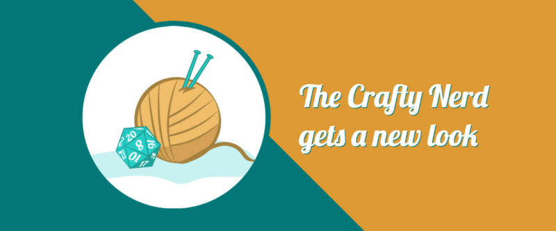
You’ve probably noticed it by now – things look slightly different around here. After nine years of the site being magenta and gold, and five years with the yarn and classic gaming console controller, I decided it was time to switch things up a little bit.
… and yes, I made a video showcasing the new logo. I’m ridiculous, I know.
Why change things up?
Well, with everything going on lately, I felt it might be time for a bit of a change. For one thing, the old color scheme is something I heavily associate with Rana, and all the time we spent working on the site together – and while I miss her so much, I feel like changing the colors is going to help give me the jumpstart I need to get working on the blog again. When it comes to the actual logo itself, I’m not that much of a console gamer anymore, so the Super Nintendo-inspired controller isn’t really a good fit anymore. All in all, it’s time for something new.
So, I made a couple of changes to the logo and site colors. Teal has been one of my favorite colors for a while now, so I wanted to find some way to work that into the logo. Additionally, while I may not play many console games now, I have always enjoyed playing tabletop RPGs. Switching out the magenta controller with a teal twenty-sided die sounded like a good change to me, and so I made the switch. Making that d20 was a bit of a process, though. (I learned how to skew objects in Illustrator in order to make the numbers look right, which is something I previously only knew how to do in Photoshop!) I almost changed the logo font as well, but it just felt wrong seeing The Crafty Nerd’s name in any font but Lobster 1.2. I wanted some change, but not that much change.
As it turns out, my office décor is turning out to be mostly teal, which works out nicely with the color scheme changes for the blog. I originally planned on painting the walls in here blue, then briefly entertained the idea of painting a wall or two purple… but now, it’s looking like teal is the dominant color in here. I’m totally fine with having my blog match my office – it kinda makes everything feel a little more professional. And I’ll admit… the new desk chair I bought in a lovely shade of mint green may have influenced my logo color choices, too. (I’ll talk more about the desk chair next week, though.)
Looking back: the original logo
While I’m talking about the logo: for those of you who haven’t been around since I started the blog, did y’all know that my original site logo was very, very different?

The original site header for The Crafty Nerd. Pretty sure I sketched that out while I was working on one of the Doctor Who scarves I knit way back in the day.
Much like the newer logos, I made this one from scratch as well – it originally started out as a sketch I doodled on some scrap paper during a meeting at work. Instead of putting together the digital version in Illustrator, though, I did it in Photoshop. And I didn’t really think about how well it would translate to things like business cards or stickers or other things I might use to market the blog. (Then again, back in 2013, I wasn’t really expecting the blog to last more than maybe a year or two, so the possibility of making stickers to pass out at conventions wasn’t anything that had entered my mind yet.) I did use the “me knitting a scarf” logo on some of my very early business cards, but it didn’t really work out well in a small format.

I can’t believe I still have some of these laying around – these were not the best business cards I’d ever made.
I could go on and on about the evolution of my site’s graphics, but I’m probably the only one who’d find that interesting. (If anyone’s curious as to what the site’s looked like over the years, check out The Crafty Nerd on the Wayback Machine starting in 2013 – before then, the domain name wasn’t actually mine) For now, I’ll just say that back in 2017 I realized I should probably have some coherent branding, and finally settled on Lobster 1.2 for the main font and created the yarn and controller logo that everyone’s likely more familiar with.
Of course, now that I’ve changed the logo and the site’s colors, I’ll need to order some new business cards, and maybe some new stickers, and maybe update the designs in the Crafty Nerd Redbubble shop and link to it from here again… I’ve already gone and ordered a new desk mat from Inked Gaming (they make beautiful custom game and mouse mats!) – I can’t wait to see how the new desk mat looks when it gets here.
New branding = more blog excitement
I’m actually excited about the blog again, for the first time since Gen Con 2020. This is a big thing for me, folks. I mean, come on, I wrote two blog posts this week, and wrote outlines for three more posts. I think that’s more than I wrote for the blog in all of 2021. I am so, so excited to finally have some energy for the blog again.
Stay tuned for what I hope will be the start of weekly blog posts, starting with next week’s review of the fancy gaming desk chair I bought!

